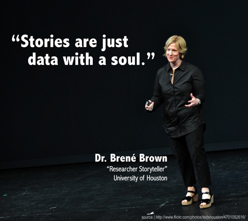
When you’re working in analytics, telling a story can be as important as the actual data behind it. Your analytical insights are only as good as the actions that you can take from them, and persuasive presentations are at the core of convincing business people to act. I realize that sounds cliche, but it’s true. Without effective presentation skills, an analyst’s job is incomplete.
At MITRE and at Sestra, I’ve worked with some great engineers, but they have a tendency to put WAY too much information on their slides and to get lost behind the language there. It’s always surprising to me to discover how little education many people receive around effective presentations. I feel lucky that my grad school program focused on these skills, and I draw from some of it’s lessons below.
The most prominent example of this lack of presentation education I experienced was at MITRE when one of the smartest folks on my team presented results of work that he had done. He’s a terrific engineer and was doing brilliant work. However, the presentation was one of the dullest that I’ve ever been in attendance for. Every slide had paragraphs of text, and he mostly read them to us. For 45 minutes. I was even on the more technical side of the audience, and I couldn’t understand most of the terminology. It was a disaster.
To avoid a situation like that, here are 5 quick things to remember when you’re compiling your next presentation.
1) WIIFTA – What’s in it for the audience? – Remember that you’re not giving the presentation for you. It’s for the people who are listening. A typical example of a WIIFTA consideration could be a detailed methodology slide. This slide is important to you – it’s a clever new twist on an analytics technique and without you, your company would never have thought of it. But it’s not about you.
Consider your audience:
In a context where you are presenting your findings to a room full of data scientists looking to learn the latest language or technique, this slide would be absolutely appropriate. It’s a clever new way to look at something and this group wants to learn about it. However, in a context where you’re presenting the conclusions of your research to your company’s executives, it’s likely that this slide should minimized or removed completely, because this group doesn’t care. They likely trust that you’ve found a good solution, however you got there, and they just want to know why they should make a certain decision.
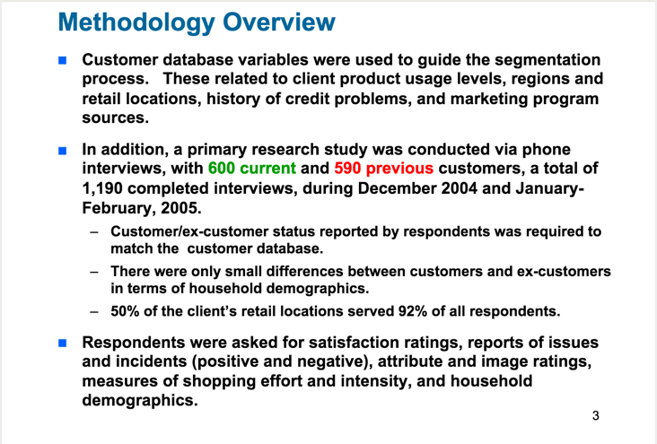
Oy, the following slide has some other issues (which we’ll revisit later), but if your audience demands a methodology slide, fine, include one. But if you include this slide when presenting to your boss, you’ve probably already lost her (and this is only slide 3!).
2) BLUF – Bottom Line Up Front. – For most young analysts, this is the single biggest change to your presenting skill set that you can make. Oftentimes, an analyst wants to lay out a bunch of evidence and allow it to walk the audience to a conclusion. This is how your research worked, and it feels like the right way to structure your findings and to tell the story, too. It is not. In a business context, the audience wants to know exactly what they are listening for immediately. This goes for a presentation as a whole, along with individual sections or slides.
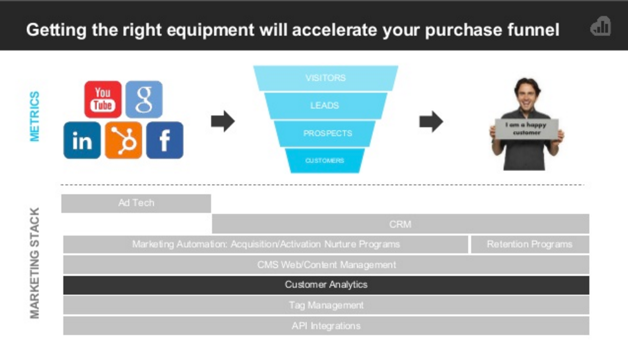
Check out this slide from kissmetrics. Even at 10% size, you know exactly what the slide is about. Well done. Most analysts writing this slide would have made the header “Equipment Choices” or some equivalent, but it is so much nicer to know exactly what conclusion you are supposed to draw right away.
3) Seriously. Less Text. If someone is reading your slides they’re not paying attention to you, the presenter. Minimize the amount of reading that they have to do while not listening to you. I recommend trying to keep slides to 1 statement or phrase or conclusion per slide.
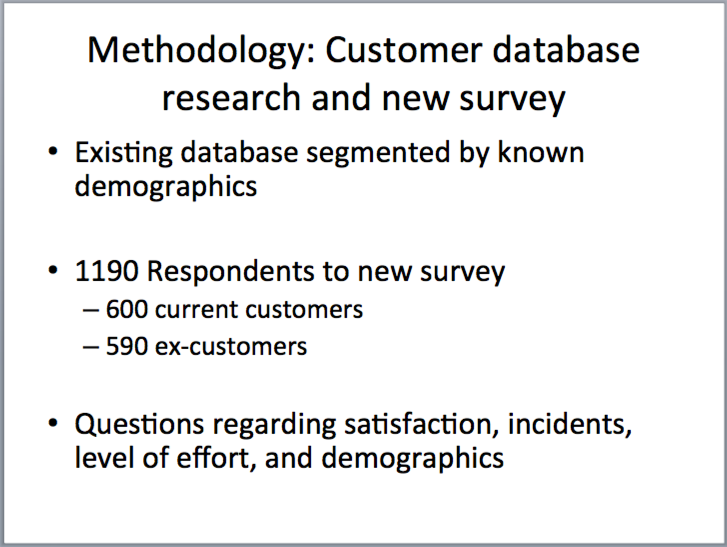
Let’s look at that methodology slide again. If you have to include it, because your audience is interested, could you make it less of a giant block of text? Try to reduce this slide to a few key ideas:
4) Make a separate version. If your slides need to stand on their own, that’s understandable – sometimes not everyone can make the live presentation. However, the deck that you use that can stand on its own shouldn’t be the same version that you use when you’re presenting with it. By definition if it can stand on its own, you don’t need to be there and you’ve just made yourself obsolete. Yes, I know. Maintaining two separate versions of the same presentation can be a hassle, but it’s worth the trouble.
The following slides are from a presenstation that I gave recently. Forgive the bad BLUF in the second slide, but it shows how I maintained a different variation for people who missed the in-person presentation.
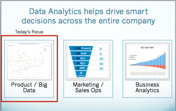
5) Make use of highlights and callouts to draw the eye. Sometimes you need to show a larger about of information on a slide in order to give context. That’s acceptable, at times, but make sure you’ve simplified it as much as possible. Once you’ve done that, use highlights, or bold, or boxes to draw attention to the important takeaway from the slide.
Look again at the slide from my presentation above. While analytics can be important across the company, this particular presentation was focused on Product Analytics. I wanted to call out the fact that going forward in the presentation, we were focused on that area.
If you keep these 5 things in mind, it’ll help keep your audience engaged with you as you take them through your data story. If you forget, you risk losing them before they get the whole story, and you can’t get your point across.
For some more detailed reading, Avinash Kaushik’s Storytelling with Data article is also a terrific read!