I wouldn’t be where I am without the help that I’ve had. Now can I help you?

I’m Lucky

2020 has forced me, like many others, to reflect on my own privilege and why I’ve been able to accomplish what I have.

I want to show gratitude towards the folks who helped propel my career where it is today. I had/have so many things going for me, and these people played a bigger part than most. If you find yourself stuck in your career, maybe you can find some inspiration here from a lesson that someone taught me. Who in your life can play a part like these?

Coach Condon – Making things happen for so many of us.
John, Tristan, Wade, Tom, Emma – Thanks for taking a chance on me!
Konrad, Vicky, Lev, Muness – You have taught me so much.
Richard – Starting our first business together.
Alyson and Sam – Everyone needs family friends like you in their life.
Emilie, Ally, Stephanie, Simon – Thanks for the continuing amazing peer-learning.
Lindsey – Thanks for the love, support, and health!

If you narrow in on the people who took a chance and influenced a step-change in my career arc, it’s sobering how many times there are personal relationships in addition to my own hustle. While I created some of this momentum on my own, I had the confidence to do so because of all of the rest of the times where people like this helped make sure that things worked out for me.

I’m offering free coaching for underrepresented folks in tech

Even if I take for granted that I’m good at what I do, without these people (and so many more) willing to believe in me at various points in my career, I wouldn’t be where I am. I’m certain that there are great people out there who haven’t been given those chances, and that’s why I want to try to pay it forward by making some of my coaching free.

Who helped you get where you are today? Who’s the best person you know who hasn’t been given that chance yet? Should you recommend them to work with me for free?


Appendix – More detailed gratitude – Who does these things for you?

  1. Jim (Coach) Condon – there’s likely no businessperson with a bigger impact on my career arc than Coach Condon. I still remember him giving a career day presentation about CyberCash (think some pre-alpha version of PayPal crossed with Bitcoin) and just the general knowledge of business that I picked up spending time at their house. Even as a kid, I had a sense that I might want a career like his one day: rarely a founder, but serial executive. It gave an interesting target for thinking about what I could accomplish and drove me to consider what a path like that might look like. Obviously someone doesn’t just “become an executive” so I had to learn to think backwards from there. Plus, he personally got me my first two amazing jobs in high school, and directly influenced a job or two later than that. I’m confident in saying that without Coach Condon, my career would look completely different.
  2. John Bracken – When I decided that I wanted to get back into tech/startups, I knew that I had the skills and passion for it, but getting that first transition job is always a challenge. By encouraging me to start as a side project (he didn’t even know that I was going to suggest that to him!) he gave me the chance to prove it.
  3. Konrad Waliszewski – While John gave me my shot at Speek, Konrad showed me the type of leader that I want to be. To put it simply, I know that I’m not alone as a former coworker who hopes to get a chance to work with Konrad again.
  4. Vicky Volvovski – I’ve never seen anything like Vicky’s career arc at Zapier. While we bonded over both having to apply 3 times before getting hired at Zapier, it is our working relationship that has taught me so much. Knowing that someone is good enough at “getting stuff done” to go from blog freelancer to the Zapier exec team is an inspiration. Her approach to solving problems and thinking about the business is something that I’ll continue to apply regularly. And if we could all just get stuff done like she can, there’s no limit to what a team can accomplish.
  5. Lev Volftsun – I knew from high school how successful of a businessperson Lev was, so I wanted to work for him just to learn how he thought about running a company. Working for him taught me the power of expectations in business: both for yourself, and also for others.
  6. Tristan Handy – In Fishtown’s very early days, Tristan was turning down work because his folks were too busy. Dbt was brand new and in one of the only cases I can remember, I was completely uncertain whether or not I could pick up some of that work. He convinced me to take on a short contract stint with them anyway, and said that I’d be fine. I know that the data modeling skills I worked on during my time there influenced my ability to get later jobs.
  7. Wade Foster – While I work for Wade now, that wasn’t how my time at Zapier started. Wade took a phone call off of a cold email and stayed in communication over a number of months before we found the right fit for me at Zapier on the data team. It only took 3 deep interview processes! 😂 Even after I was working on the data team, it was not necessarily obvious to create the role for me working for him that he did, and I still remember his quote the day we decided, “I’m still not sure this is going to work, but I’d like to give it a shot.” I hope that choice continues to pay dividends for both of us!
  8. Muness Castle – My first Zapier manager, helped ensure that I was able to work on projects that helped me grow and show off the skills I’d need later. Without some of those assignments and opportunities, it’s not certain that I’d have gotten the later roles that I did.
  9. Emma Candelier – I wasn’t completely sure how I was going to wrap up my last year at UVA; I was considering a 5 year MA in Math, but I knew I liked business, too. Talking through my options for MS Commerce with Emma set me up exactly where I wanted to be coming out of school.
  10. Richard Kim (and his parents) – The best man at my wedding and also my first business partner. Without our tiptoes into tutoring businesses before and after college, I’m not sure when I would have incorporated my first company. His parents’ company was also a success story that guided both of us towards business, but also served as general inspiration for what success can look like.
  11. Sam and Alyson Rod – In addition to being our closest family friends and a core part of my personal support system growing up, knowing that they “ran their business from the basement” made owner-entrepreneurship a completely normal part of my childhood. Plus, Alyson embodied the type of adult and parent that I still aspire to be. I wish everyone had someone like her in their life, and I’m so grateful that I do.
  12. Emilie Schario, Ally HendricksonStephanie Couzin, Simon Ouderkirk – Haven’t had a chance to work together with you all in the same depth that I have with most of the folks on this list, but after all of our conversations, I come away motivated to do great. We all have high expectations for ourselves and others and I appreciate being able to bounce ideas and learn from all of you!
  13. Tom Becher – Data Analytics was still not-well-defined when I first reached out about a job. Thanks for taking a chance on first year college student. My time at MITRE helped be build the core of my technical data analytics skills that continue to serve me well today.
  14. Lindsey and Jean – It might be cliche to include my wife and daughter here, but it’s my post so I’m doing it anyway! 😆 Without Lindsey I wouldn’t have learned to reflect to the degree that enables a post like this to happen. If I want to tie it more directly to career, she’s a big part of why I eat healthy and develop healthy habits that continue to allow me to perform at a high level.


Remote Work 2.0 – Doing remote right; lessons from Zapier and what COVID Changes

Remote work is the future of technology.

I first wrote about my feelings on remote work on the third post on this blog. Since then, I’ve only become more convinced. Remote work continues to be extremely desirable to the technology workforce. A survey that Zapier ran says that 74% of people would be willing to quit their job to take a remote one.

COVID has thrust us all into a remote-work experiment, but clearly some organizations are going to do it well and others are going to fail at the important concepts.

So, what’s it like working remotely for a company broadly recognized to be doing it well?

Remote means that you can hire from anywhere

While this statement is obvious, it’s the only place to start. The fundamental competitive advantage to an all remote company is the quality of team that you can assemble. I’m perfectly willing to admit that a specific group of people, working co-located, is probably more effective in the short run then that same team working remotely. However, it’s not realistic to assemble the same caliber team in any single city as you can when you hire from anywhere.

Problems like losing an employee when their spouse needs to move, losing someone great because the commute is too long, or having a great person to hire that’s in another city are common at work. None of those things happen with a remote team. You can find the best people in the world to do the exact thing that you need them to do.

But timezones cause headaches

When you’re looking for the best people, you may not even find them in the same timezones. For me, in US Eastern time, it’s extremely difficult to have any overlapping hours with Singapore, India, and Australia. While we can make it work occasionally, it’s not realistic to expect it to happen often. That means that many decisions that need input from people around the globe require minimum 24 hours per iteration. There’s no doubt that this is slower than everyone working in a conference room together (or even on a zoom call).

Generally speaking, you can overlap EST with much of Europe, all of the Americas timezones together, and PST with APAC. But if you have EU, US, and APAC all on the same team, it causes a burden. We haven’t yet grown large enough to consider siloing our teams into overlapping-timezones-only. Even if we went that route, it would cause other types of communication problems. This is a continuing challenge for any global organization.

Remote work forces smart communications practices

Zapier focuses on written communication. From early in the company’s time, lots of things are written down. Because realtime communication happens mostly in slack and “more official” comms and documentation happen in other written tools (Quip, Google Docs, Coda, or Async, our internal blog) there’s often a much better historical record of decisions, events, goals, targets, and strategy. Certainly there remain times where we wish that we had more written down, but in general if you search all of those tools, you can probably find something interesting on the topic you’re considering.

But knowing how to find the information you need is correspondingly a huge challenge

As we’ve blown past Dunbar’s Number it’s increasingly difficult to know where to look or which tool has particular bits of information. Google Drive’s folder organization is bad. Historical Migration between tools (hackerpad->Quip->Coda trial for us) means that the thing you’re looking for may be split across a bunch of different tools. You probably need to go search all of them. Quip’s folder structure and organization feels better than Google drive, but it’s somewhat of a dead product after the acquisition. We’re increasingly hearing on internal surveys that information centralization is our biggest opportunity for organizational efficiency. This challenge is so big because for a company our size we have a ton of documentation.

That said, this is a net win. I regularly go back and pull from research and experimental results published years ago (sometimes even from before my time at Zapier!) which means that at least my searches work just well enough. I think that we actually need to look up towards more enterprise companies to learn how they deal with this issue, since it’s not unique to us or to remote companies. Once you reach a certain size organization, information retrieval becomes a huge challenge. We have lots of learning to do.

Go all in, or fold.

I’ve worked for co-located companies, half-remote companies, and fully distributed companies, and I continue to believe that for remote to work best, you need to either go for it, or give up on it. Perhaps there are other organizations doing better at the blended setup than I’ve seen, but it seems extremely difficult for anyone remote on a team where many things happen in person to build the same types of relationships needed to be successful. When the entire company is remote, everyone is on the same playing field, and everyone works on relationships in similar fashions: zoom calls, on company retreats, and in your 1:1s. When half the team can go into a conference room and chat, and the other half can’t, I think it’s fundamentally unlikely for the remote folks to get equivalent recognition. Even with everyone acting in good faith, it’s just unlikely to be able to build relationships that way.

The most interesting thing that I’ve seen in this space pre-COVID was Stripe’s recent announcement of remote-as-a-location. By clustering the remote folks into their own “hub” I think that they might be able to overcome some of these downsides. I wish them the best and look forward to seeing how it goes! That’s not an option for most small companies, though, and the risks with a half-and-half approach make it troublesome to me.

Quora seems to be the biggest player I’ve seen so far make the post-COVID-remote-first switch with great messaging. But they will leave an office open, too, for now. Adam’s post is extremely thoughtful, and you should read it if you’re interested in this transition.

I remain skeptical that the half-remote thing will work in any significant way.

If you want to see the official Zapier resources on running effective remote organizations check out the Remote Work Guide. And if you want some recommendations on my favorite work-from-home accessory, check out this post on headphones!

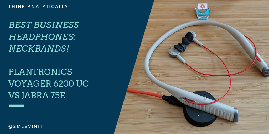
Best Business Neckbuds – Plantronics Voyager 6200 UC vs Jabra 75e vs Bose QuietComfort 35 vs Bose 700s – Headphones for remote work and video calls

One fact about working remote is that you end up on a lot of video calls. Building rapport is tough and body language matters, so being able to see someone and communicate is important. Bad audio is a huge problem when most of your conversations aren’t in person.

Plus, if you like to work from coffee shops or while traveling, being able to block out the outside world and concentrate when needed is mandatory. Active Noise Cancellation comes on more than just Huge Headphones and it really does cut out a lot of outside noise.

Random Tangent – the best thing to happen in noise cancellation in the last 5 years is krisp.ai. It’s software that helps a shocking amount – give a try for free at that link! Seriously. Ok back to business here.

Thankfully Zoom has gotten pretty good at delivering a quality audio/video experience most of the time. Even so, having worked at a telecom / conference call company, I can say fairly forcefully that most audio problems are on the participant side. The biggest issue? Headphones.

Protip: You need better headphones than the ones that came with your phone. This isn’t the place to cut corners.

First, pick a style.

For me, this is the neckband / neckbuds. Unlike seemingly everyone, I don’t enjoy full wireless earbuds that apparently everyone loves or huge over the ear block out the world headphones. When I wear the giant ear covers, the heavy headphones hurt the top of my head. When I gave “True Wireless” Earbuds a shot, I could never find a pair that fit my ears. Plus, I often listen with only one earbud in, and switch ear-to-ear. Most True Wireless Earbuds won’t support that. So, neckbands are the best for me.

My Favorite: Neckbands

When looking for a high-end set of business-focused neckbands, there were two choices that stood out as the best neckband headphones:

Jabra Evolve 75e UC and Plantronics Voyager 6200 UC

The Jabras

The Plantronics

I also considered the Bose QuietControl 30, but at this price range 🤷‍♀️ can’t try them all. (Hit me up if you want to send me a pair to test drive, though, Bose!)

Second, figure out what pair works for you

I’m a researcher by nature. When I want to buy a thing, I do a load of research on what the right choice is. The headphone decision has been brutal, though, because it’s almost impossible to judge the comfort and fit based on someone else’s experience. And basically everything else is secondary to that concern! But, you’re here and reading, so here goes.

Since both of these are neck buds, the weight of the headset is mostly on your neck and shoulders. That means that in each case, the earbuds are extremely light. They both come with 3 sets of sizing inserts to try to fit both ears. For me, they both actually worked – unlike any true wireless buds that I’ve been able to try.

I like both, but the call quality on the plantronics seemed much better with my MacBook Pro, and since that’s the number 1 concern here, they’re my go-to pair. Ever heard robot voice on a call? Yeah? That’s what happened most of the time on the Jabras. It’s possible that it’s a firmware clash or something, but this stuff should just work. Surpisingly, the little USB dock so that I don’t have to plug in a USB cable is quite convenient and lives on my desk so the headphones stay fully charged. When you are on lots of back to back calls, that’s surprisingly important.

Since I’m a deal hunter, I got a good price on both sets, so I ended up keeping the 75e and pairing them with my phone. The call quality there is quite good, and since I’m out and about more with those, the earbud magnets connecting and hanging together is helpful! Plus, the wings on the Jabras tend to help them stay in my ears a little bit better, so for being out and about, they’re my go to. Last, they have a specific “Hear-through” mode, which is the opposite of noise cancellation. It makes them much safer to use walking the dog so that I can listen to my podcasts, but still hear cars coming!

Most people’s choice seems to be huge over-ear noise-cancelled headphones. If that’s your jam, it seems like you’d need a reason not to get the Top of the Line Bose set. Zapier’s suggestion (and probably the de facto standard) is Bose QuietComfort 35 II. In the realm of high end audio, it’s hard to go wrong with Bose – though do be aware that the new Bose 700s are supposed to be the next generation here. My suspicion is that the extra microphones in that pair will end up making them preferable for business calls, while the $50 price difference isn’t huge.

The curveball: Bose Soundwear Companion Speak

One of the Execs at Zapier swears by these Bose speakers. They make it so that he doesn’t need to wear headphones to be in calls all day, and having been on many calls with him I can say hat the sound quality, in his quiet office, is pretty good! If you hate wearing headphones even more than I do, check these out as an alternate option so that you don’t have to use the laptop mic and speakers.

Churn.fm podcast: Why churn cannot be measured with a single metric

Andrew Michael and I took some time to chat about churn metrics on his podcast churn.fm.

We talked about the different between revenue churn, user churn, and logo churn. Plus, how startups should think about churn in their business at different stages.

Give it a listen and let me know what you think! https://www.churn.fm/episode/why-churn-cannot-be-measured-with-a-single-metric/

The path to being the best data analyst: Help, Build, then Do.

The core competency of a data analyst is “Speed to Insight”.

A data team often consists of many people, with many skills, using potentially overlapping techniques. This focus on speed distinguishes this role from data scientists or statisticians. Today I’m focused on answering questions about the business or about how users behave. I’ll refer to these types of questions as mostly in the realm of data analysts, though some orgs call these folks data scientists, too. A good data analyst should be able to interface directly with folks in the business unit that they’re working with. They need to have a solid understanding of business fundamentals in addition to data chops. A junior analyst may rely on business people asking smart questions, and answering the questions that they’re asked, quickly. While this is clearly helpful, it’s not the highest-leverage opportunity for an analyst. The best analysts don’t only answer the questions that they’re asked. Actually doing analysis is often the easy part. It’s other skills that separate an average analyst from the best.

Help teammates rephrase their question.

Ask the “next 3 questions” that they should know

When you’re asked a particular question, it can be tempting to think “sure, I can answer that”. While that might be the first step, it’s important to get at the root reason for the question. If someone asks for the signup conversion rate across a section of your website, it’s the analyst’s job to dig in. Why are you wondering about signup conversion? Would we rather measure conversion to active users? Are you interested in a particular segment? Does the signup rate vary across paid, direct, organic, and social traffic? It’s unusual that a PM wants a metric for the sake of a metric. They’re really trying to learn something about the nature of your product or your audience. It’s your job to know enough about your data sources and about the business itself to answer the next three questions that they didn’t ask. Short circuiting the back and forth will help your team move faster.

Answer faster by proposing a reframed question that’s close enough

Stakeholders may have a rudimentary understanding of what data is available, but they may not understand that a simple alteration of a question might reduce the time to answer from a day to an hour. No data team ever has all of the data that they want, modeled to answer every question. When someone asks a question that would require a new data model or custom work, see if you can reframe their question into one that you can answer quickly with existing data models. This most often to happen when they ask something extremely specific. They might even be asking a better question, but they may not care that much about the specifics.

Which of these 10 customer segments has the highest Lifetime Value (LTV)?

This is an astute question, and likely means that you’re dealing with a data savvy stakeholder. Say that “everyone knows” at your company that these are your top customer personas. But let’s say that you’re a young company and haven’t done segmented LTV calculations yet and have no easy path to getting this answer. You probably have “total dollars collected” easily accessible, though! In that case I would propose this counter, “What about if I give you Total Dollars Collected per user in segment?” Assuming that none of these user groups are systematically newer or older than others, that’s probably close enough! If the stakeholder is looking to prioritize marketing campaigns over the next couple of weeks, they’re not going to want to wait for a new LTV calculation. By reframing the question to one that was close-enough, you unblocked them a week early! That’s leverage.

Reframe to question that they should have been asking

For quite some time at Zapier, we had better data modeling around the number of Zaps that were “turned on” versus the number of Zaps that “had activity”. This lead to a tendency to rank various important KPIs and concepts using zaps-turned-on instead of actual activity. In most cases, this was fine (see reframing to be close enough, above), but once we got large enough to start noticing differences between turn on and activity, the data team made a concerted effort to help folks reframe their questions (and KPIs, and dashboards) in terms of activity! This is a better measurement in most cases, and when folks would ask for a turn-on count, we would ask them if that was really what they wanted.

Build Self-Service Tools (I consider Business Intelligence to live under the Analyst Umbrella at most organizations )

Building V1 is the quickest way to build stakeholder investment in data

The introduction to data driven decision making at many companies will come via an analyst working with the team to turn their goals into measurable outcomes. In the first iteration this often means building a dashboard or similar interface for folks to have access to answer those same first questions without you. Next, you have to build out data structures that are intuitive enough and well documented enough that you can advance to letting people explore the data on their own. Tableau, Looker, and similar tools are designed with the idea of letting savvy business users discover the answers to their own questions. Analysts who empower that will excel. How do we ensure that an analyst isn’t the only person diving into data? Well…

Teaching your team to answer their own questions makes everything go faster

In general, folks aren’t going to be comfortable mucking around in your data without some training. There are definitely good intros to [Looker|Tableau|Etc] out there, but they won’t explain your data sets. Good data teams will create intro material using real data, and actual questions that folks might ask in order to get them more comfortable. Success here doesn’t mean that everyone becomes a power user. Ideally, most people have enough familiarity to look around and feel good. Then, the few folks in various places around the organization that get really good are a massive force multiplier for the data team. At Zapier it’s our head of platform, a senior PM, a person in partner ops, and a writer. As good as an analyst might be at “understanding the business needs”, you’ll never be in it as deep as they are, and for the 80% of questions that are self-serveable, everyone wins here.

Do

Sometimes, your stakeholders are never going to DIY with BI tools. Sometimes, they ask questions that are too difficult to self serve, or require too much nuance. These are the best use of your analytical time. In those cases, you should still be willing and able to help build-it-for-them. The PM and head of platform that I mentioned earlier? They always have the most up-to-date and fastest time-to-insight of any teams in the org because they get so much of the way there themselves. In the best cases, you end up with a new data model that will let those types of questions be easier the next time. Analysts who follow these steps are likely to become the go-to folks on the data team. That’s good for the business, since you’re empowering people around the org. Plus it’s great for your career.

Anything else that you see good analysts do regularly? Hit me up on twitter @smlevin11.

These opinions are mine, and don’t represent Zapier’s official stance on associate, staff, and senior positions.

Looker vs Tableau vs Mode, etc. Business Intelligence and Data Visualization tools compared.

Post Updated: Sept 2020

While Looker has become my default option, you might consider Tableau, Mode, or Chart.io

Data Viz tools can make or break the impact that a data team has on the organization. If your method of insight delivery is incompatible with your organization and team structure, you won’t have any success, no matter how clever your analysis.

So, after ingesting your data with one of the great data pipeline options, and choosing a data modeling tool, you need to figure out what data visualization or Business Intelligence tool to use.

I tend to operate faster in conjunction with a data visualization tool than in SQL alone, since it’s much easier to see trends and conclusions in visual formats than in a table. Additionally, simple dashboards can help reduce repetitive work and let you be more of an analyst and less of a data monkey.

Ok great, but what are the best data viz options for small-mid size teams?

1) Looker – The default premium option

Best for: Most data teams looking to put in place a solution that will work for both analysts and business users now and scale well later.

Pros: Looker has become my go-to choice for BI projects for companies that are far enough along to afford it. The key is that it’s flexible and powerful enough for analysts to use everyday, but just simple enough for savvy business users to help themselves. You can build standard dashboards, or interactive “explore” pages, and it even includes it’s own data modeling layer “LookML” to allow quick access to ETL functionality for a team that doesn’t have a robust Ingest->ETL/dimensional modeling->Visualization stack setup.

You’ll definitely benefit from a strong data team on the setup side, but several PM’s at Zapier have become power users (even to analyst/developer level) and a huge percentage of the team uses it occasionally.

If you read my blog regularly, you know I love working with the folks at Fishtown Analytics, and Tristan wrote a similar writeup with even stronger feelings than mine that Looker is the default choice.

For another example, Buffer seems to love looker, and I use it everyday at Zapier. So there’s definitely a loyal following among the young-tech crowd.

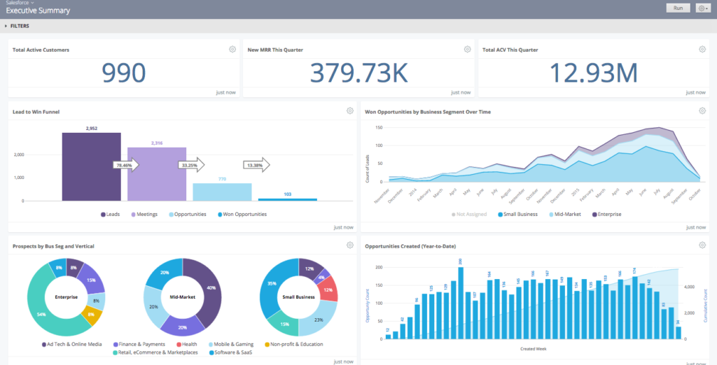
Cons: The visualization options are limited compared to a more robust offering like Tableau, but it does cover 90% of use cases. Something I wish it supported better out of the box is some generic conversion funnel-like views that Mixpanel and similar are based around. You can see the single example in the screenshot above, but it’s quite inflexible. A tool this expensive should replace most of your other viz tooling, but at Zapier we’re still having to build internal tools to cover a few gaps in conversion funnels and experiment reporting.

One additional point from Lukas Oldenburg on measure slack: “Looker didn’t allow for quick ad hoc data analyses with data from other sources, e.g. some csv file from some system whose data is not yet integrated into the data warehouse. This puts a huge load on the integration layer where any data source that anyone ever want to analyze with looker needs to be in that dwh, a status that we would have needed years to reach.” This is definitely a true statement. At Zapier, we ingest all of our google sheet data via matillion, but if you’re mostly doing adhoc csv analysis, your tool of choice is probably tableau.

Pricing: Compared to everything else on this list, Looker is expensive. With a standard entry point over $35k/year, it simply prices out a large portion of small-mid size teams. That said, if your business is growing quickly and needs a tool that you can start with now and won’t outgrow for years. Looker’s an amazing choice.

2) Tableau – An analyst’s best friend

Best for: teams who want to leverage the FAST analysis capabilities for analysts, and prefer stable, older products to the leading edge. In the “Data Viz for All” space, it’s hard to go wrong with Tableau.

Pros: In general, I’m a huge advocate for tableau. As an analytics guy, tableau is a terrifically powerful tool to dive into a data set, slice and dice, and come away with some pretty powerful conclusions. They’re the most established company here, and their feature set is likely the most powerful in the hands of a good analyst. Additionally, the Tableau community is large, vocal, and full of knowledge. You’re more likely to get a great answer on their forums than anywhere else. Plus, if you’re hiring junior folks, Tableau is likely the tool that they worked with in class or in school.

Tableau Prep gives them a competitor to more robust ETL tooling. This review from interworks can give you an idea of what to expect if you wanted to try relying on Tableau prep instead of a dedicated modeling layer. I wouldn’t recommend it (go DBT instead!), but it it is possible.

Tableau has the same type of benefits as Looker as far as business users go. You can develop a ton of self-sufficient usage among the company, even in relatively deep use cases. This is especially true given how good the help forums are.

Update Sept 2020: Why Tableau these days? Caitlin Moorman, head of Analytics at Trove, and formerly Sr. Dir. at Indiegogo had some more up-to-date thoughts:

Business users love Tableau because it’s super intuitive if you can use Excel. There’s much more flexibility on visualization, even with basic cross-tabs (more flexible pivots, drill paths that keep you within a workbook rather than popping you out of it, better subtotals, etc.). If you have the time and bandwidth to build beautiful viz, then you can do some really impactful work. If you use extracts it’s crazy-fast (though them limited on granularity), and though this is a silly thing, the ability to have multiple tabs within a dashboard allows for much more intuitive analysis/reporting workflows. The advent of dbt makes it much more manageable as a shared solution than it used to be, since it’s easier to keep most of your modeling out of Tableau and suffer less pain from the lack of version control / full UI-based modeling / etc.


That said, I migrated away from it both in 2015 and 2019 because it’s just a giant pain to maintain. Working in the UI is not fun, you need to bounce back and forth between Server and Web frequently, and lack of version control is painful. Looker may have only 80% of the viz capabilities, but my team can move so much faster (without breaking things), that we can still get many more insights out into the world with the same hours in the day.

tableau sales dashboard

Cons: Feels a little dated – you can feel that Tableau was designed before cloud-only SaaS applications ruled the space. Also, it pulls data into tableau data extract – because tableau was around before the redshift style cloud analytics databases, it’s predicated on pulling data into their proprietary engine. While that’s not a huge issue, it is obnoxious to have to pre-connect to each table individually, where every other tool is basically “connect all”.

Pricing The per seat licensing is frustrating for small-medium teams that want to use it honestly. “Who needs a seat?”-type questions arise regularly. That said, with their new SaaS pricing plans introduced in the last year, they now have one of the lowest entry-level price points with the seats at $70/month for the analysts and $15-42/month for others on the team.

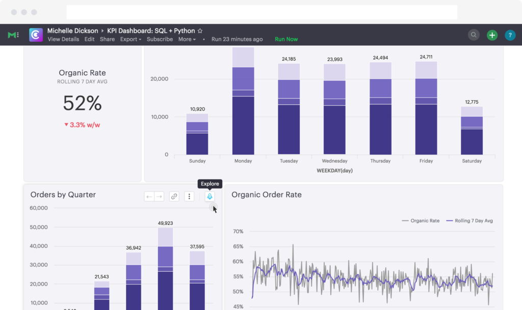
3) Mode Analytics – When your primary focus is productivity on the data team

Best For: Data Team collaboration and work, where business users don’t need much self service.

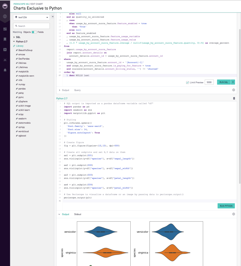
Pros: The data analyst / data scientist workflow combination is first class. Mode allows SQL Analysts and R/Python users to sit in the same tool and work side-by-side. No other tool does this effectively. Additionally, the shared workspaces and dashboards that the team can collaboate on are first class, if you often have multiple folks working on the same material.

Extra Shoutout – Mode offers free intro to SQL and intro to Python courses online. Combined with a terrific free level product for individuals, they are an amazing way for someone to break into the data space. They deserve special kudos for that.

Cons: To be a data-explorer level user in Mode you need to know SQL, Python or R. That means that it’s great if your analysts are always going to be developing reports and answering questions. However, if you want business users to be able to explore much from scratch, you’re likely to struggle.

Pricing: Mode recently stopped publishing their pricing, so as of Early 2018, they were charging $500/mo for most teams. Since mode is a team-based tool, they don’t upsell the seats, which is nice. You can collaborate and share effectively among the data team, and publish results for the business users to look at.

3a) Periscope Data – Honorable Mention

Pros: In the couple of years since I explored periscope last, they’ve invested in becoming a close competitor to Mode. That means the feature set is building out quite quickly.

Cons: I struggle to see when I would choose them over Mode given that they seem extremely similar, and I have Mode experience. YMMV

Update: Leon, the head of data at Periscope, reached out with a few comments that I thought were worth quoting here.

“Periscope Data offers much better performance and more advanced analytics capabilities, according to customers who evaluated us against Mode. These include our integrated Python/R editor in the product, more collaboration & sharing options, easier embedding and reporting capabilities, and an overall faster platform. More importantly, our new “data discovery” for business users helps non-technical users explore data via a drag & drop interface to find answers on their own.

We enable advanced data processing capabilities, powered by our Redshift cache. We automate the data migration into the cache, provide access to cross database joins, and even unlock last-mile data prep via materialized views. That really helps data teams to quickly establish a single source of truth across the entire organization, while improving load times by preprocessing heavyweight data transformations.”

Given the above, if you’re in the market for this type of data-team-based sql/code focused BI, get demos or a trial from each of them!

Pricing: $500-$5k/mo

4) Chart.io – Everyone in the company can learn

Best for: Teams where the only users are business users (no true data analysts)

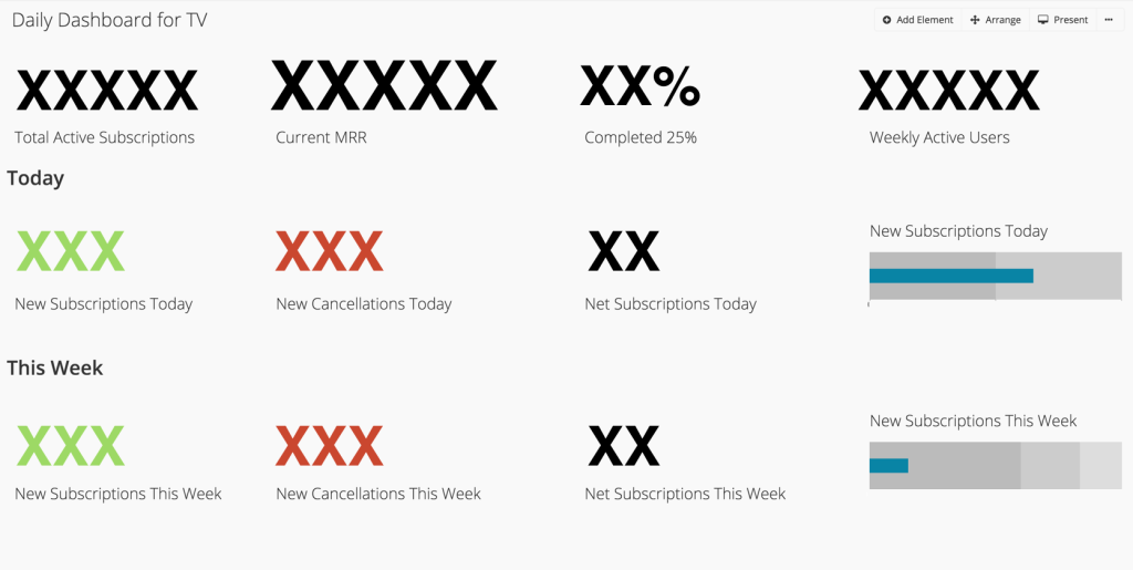
Pros: Easy to use, for real – Most of these tools claim to be easy to use, but it’s typically only half true. I do think that chart.io’s step-by-step chart development procedure can make answering questions more straightforward than in tableau or looker, where you have to think through each step beforehand. Live Connection to Redshift – Updates info close to real time. Easily accessible team dashboards.

tv dashboard

Cons: Ad-hoc analysis is a hassle. If you don’t know the exact question that you want to answer, the same step-by-step procedure that’s a benefit in some cases, can be a big hindrance in others. If you want to segment a chart by a different variable, you have to edit every step that you did to account for a new column. In any one case, this is only an extra few minutes, but a few minutes per analysis, every time, adds up to a ton of lost time. For example: Let’s look at LTV by plan, then by persona, then by gender, then by first course taken. In tableau each of those what-if’s are basically instant to swap back and forth, chart.io doesn’t make it nearly so easy.

I hope this series has helped you on your way to building a more data driven company. Check out more about data pipeline options, and choosing a data modeling tool, if you haven’t seen them. Don’t be afraid to reach out in the comments or contact me if you want to discuss specifics of your implementation.

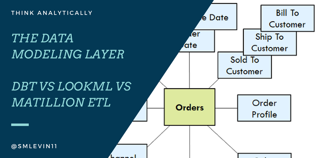
The data modeling layer in startup analytics – DBT vs Matillion vs LookML and more

Hey data team – why does the revenue in my dashboard not match the revenue in this other view? -Every Executive Ever

If you’ve been in data analytics for any amount of time, I’m sure you can relate to a question like this. Often, the answer is that the analyst who did the calculation for one view did a slightly different calculation the second time around. Maybe that analyst was you!

Fix this using a modeling layer in your analytics stack.

I agree with Tristan Handy’s analytics for startups view of the world. Once you’ve read that (or some of my past posts), you know that you should have an ingest layer, a modeling layer, and a visualization layer.

Note that there’s definite overloaded and confusing terminology in the industry around the word modeling. I specifically am not talking about building a machine learning model, a financial model, or any sort of projection or analysis. I’m talking about dimensional modeling.

Why do I even need this layer?

Consistency, repeatability, and time-savings

Most beginner analysts will work with the data as-is. The lowest-impact request you can make of an engineering team is a read-only replica of the database. The problem here is that data in a production database is optimized for production use cases – not analysis or BI.

There’s probably no history of changes, it may not allow window functions, and standard analytical queries will take a join of several tables.

On the other hand, a data warehouse that’s optimized for analytics will have a totally different structure. It will denormalize many of the database tables, will store the history of slowly changing dimensions, and will flatten tables into a 1-per-transaction or 1-per-business-entity structure so that table counts and sums make sense.

Perhaps most importantly, well-modeled data is reusable across multiple analyses. When someone asks for user count, a well-modeled users dimension is the go-to place. When you ask about revenue, there’s a single source of truth for that number instead of every analyst creating their own calculation off-the-cuff. This way you’ll get less of the questions that started this post!

Every time an analyst or data scientist is able to use well-modeled data instead of having to reinvent the wheel, there’s huge time-savings associated.

There are literal books written on this subject, so giving you an entire data warehouse philosophy is not my intent here. The current head of the Zapier data team Muness Castle recommends the Kimball modeling book The Data Warehouse Toolkit. If you want more information about how and why you should structure your data warehouse, go read it! If that doesn’t sell you on the need for this intermediate step in your analyses, let me know, and I’ll work on a post specifically about this!

For the rest of this piece, I want to evaluate a number of common options for implementing this modeling layer.

Maybe the most common option: Roll your own (SQL queries, python scripts, etc)

Without well-formed thoughts around data modeling and analysts’ needs at a company level, it’s likely that a Data Analyst or Data Scientist will end up adhoc modeling what they need as the need it.

This path requires the least up front spend and is the fastest implementation. It’s also the default path that will happen with no planning. So that’s a benefit, I guess.

But seriously! If you plan to be a data-driven organization (enough that you have someone thinking about these types of data structures at all), don’t let inertia carry you! If you invest the time up front, you’ll solve a ton of heartburn for yourself, later.

So, what are our better options?

DBT

Tristan and Fishtown’s vision for DBT is

a command line tool that enables data analysts and engineers to transform data in their warehouses more effectively.

He wants to provide an opensource, transferable skillset and framework that analysts can work in, and maintain data models in their warehouse. This is an extremely noble goal, and I’m a supporter.

Benefits

DBT is mostly a SQL-focused tool.

Most strong analysts already have a strong SQL background, and the learnings that they have while working with DBT will instantly transfer to skills that they use in a normal day-to-day.

The team is adding new functionality regularly, and are in it for the long haul.

Plus the DBT slack community is by far the best tech/startup analytics community that I’ve discovered.

Easy, strong version control and diff checks.

Since dbt relies on git code commits, most code review processes transfer quite effectively. It’s easy to see what changed between versions and rollback if ever needed. Spend a couple hours with a strong software engineering manager and you can borrow/steal all of their code review best practices.

Tests.

Dbt includes a test yaml functionality to define non-null, unique, and referenced fields. We essentially rebuilt a more robust version of this type of functionality internally at Zapier because of our combination of airflow and matillion, but we could have gotten a lot of mileage out of the DBT version if we were standardized over there.

Open Source!

For a variety of data sources, the DBT contributors (Fishtown and otherwise) have a respectable number of modeling already available open source: Stripe, Snowplow, and more.

Downsides

As of the time of this writing, DBT is still a young product. There are many edges remaining.

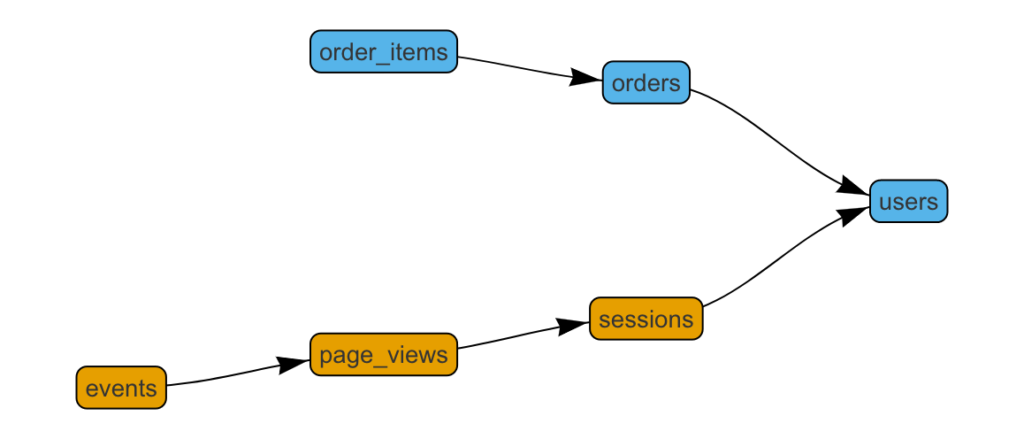
It’s 100% code as of the last time I used it – which can feel intimidating to new entrants. I know that the team is working to improve the workflow and setup process so that it’s more analyst friendly, but for now you need a decent understanding of git (or at least a git cheat sheet) in order to use it and you need a moderate level of git/github knowledge to get it setup. They did recently add in a viz tool for seeing your DBT graph.

Complex orchestrations can be difficult to navigate. Note that they do support hundreds of models being built – it’s not to say it’s impossible, only less clean than some other options. Essentially, DBT has a concept of ref() models, where if b includes ref(a), then b will build after a. Orchestration / notification beyond that is somewhat lacking – ~controlled serialization vs parallelization can be concerning last time I used it~ (See Edit). Navigation up-and-down the model hierarchy is easier for me in a GUI than in git.

However, the Fishtown team also offers Sinter Data which allows for some of the orchestration control that DBT doesn’t natively include. Or you can run DBT via airflow, etc – it’s worth understanding that you’ll have to use something in addition to the DBT base to schedule/notify/etc.

`\ Edit: I chatted with Tristan after posting this and he has a couple of valid points that are worth putting in here: DBT’s vision for parallelization is to “just handle it”. They’re trying to make it so that the analyst doesn’t even have to think about it. This is a great vision! Also, it’s been ~9 months since I did a fresh DBT rollout, which is a long time in new-product-years. They’ve done a bunch of work on parallelization since then: “We run 4-8 threads on all projects now. 4 on redshift, 8 on BQ and Snowflake.”

Cost

It’s opensource! So no out of pocket cost up front.

Matillion ETL

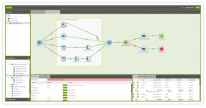
Matillion ETL is essentially a gui-ized version of SQL modeling functionality

Upsides:

Breakout of transformation and orchestration jobs helps readability.

A GUI is a great way of modeling out chains of events that naturally occur during data modeling. The Matillion interface does quite a good job of showing the builder’s preference for what should happen in what order. It ends up building out chains of SQL queries to run on your cluster based on the commands that you give it. That technically means that SQL knowledge isn’t required – though I’m not sure that I’d recommend using it without baseline SQL understanding.

Some level of ingest services included!

This is where this post and my data pipelines post start to overlap heavily. Matillion includes a broad range of integrations to ingest data from third parties, just like ingest tools. We are heavy users of the Google Sheets ingest, for sure. That said, we also tried several others with varying degrees of success, so it’s not all sunshine and roses.

SQL and python components included.

That means that if you want to fall-back to writing custom code, you can. I’ve used this for date logic that needs to update itself during our overnight ETL.

Downsides:

Search – I know that search is hard, but following a single data field all the way through a chain of 5 matillion transformations is pretty difficult. It feels like it should have highlight functionality like when you search for something in apple system preferences.

Because it ends up writing huge nested SQL queries, it can leave the Redshift query optimizer in a terrible state. We often have to break large single queries down into smaller chunks and materialize temp tables with proper keys to make a large join later in the sequence work. This isn’t a problem unique to Matillion by any means, but it’s especially apparent when the query that you were trying to do all at once takes far too long to run. Plus the GUI makes it easy to overburden the cluster with a massive query.

Cost

Matillion has an hourly or yearly cost that can be found on their site. At the moment, the yearly pricing ranges from $10k-40k/year.

LookML

One of looker’s most noteworthy points of differentiation around their web BI competitors is that they seemed to pioneer an embedded ETL / modeling layer as a component of their BI and Visualization product. I realize that they weren’t the first to have this type of offering – many of the old-school BI products presumably have this as well. But, they’re the first of the new generation of cloud-first tools to do so.

Benefits

If you’re already in the market for a BI tool, too, the integration here is a clear win if you decide to go with Looker. Writing LookML is quite fast once you get used to it. Plus there’s built-in integration with github version control (without the need to actually know how to use git!) LookML also bakes in some neat data types that aren’t necessarily baked in to SQL or your database. It lets you have a bunch of date formats and tiers, locations, and distances, plus generic “number” type that often feels easier to work with than the SQL versions.

Drawbacks

There’s a huge amount of lock-in associated with relying on LookML as your modeling layer. It means that it’s more difficult for your non-BI data scientists to access your clean, modeled data (this is a huge risk!). In my consulting time, I helped with a couple rip-and-replace jobs in order to recreate all of the LookML data models in a way that allowed broader access to these “official” modeled data stores.

Orchestrations and visuals between models are both off the table. Since this is designed as prep work feeding a BI tool, and not much else, the tooling around specific orchestration and showing how models relate and rely on one another is not great.

Cost

Depends how you’re thinking about it – looker is is the neighborhood of $40k/year minimum, but if you’re already planning on it, then there’s no added cost.

Other tools and thoughts/comments.

Airflow

For the slightly more technical, airflow offers orchestration that can wrap python jobs, or work with DBT and other tools mentioned above. It has quite a following, and I asked one of Zapier’s Data Engineers, Scott Halgrim, to chime in with thoughts on how it plays in the modeling layer space. Here are his thoughts:

Apache Airflow is a platform with which you can programmatically author workflows. Airflow uses the concept of a directed acyclic graph (DAG) for specifying workflows, which is a boon for visualization. The nodes in the DAGs are operators, each of which does some part of the work.

Benefits

Airflow’s greatest strength is probably that its open source code is written in Python, one of the most popular and rapidly growing programming languages today. Even if you don’t formally have any Python capabilities in your shop, you probably can find some engineers or analysts who know Python just by asking around the office. Since DAGs are all written in Python as well, you get nice features like text-based version control (philosophically similar to DBT), easy code reviews, and code-as-documentation built right in. Airflow is also feature rich, and offers a command line interface, DAG branching and conditional processing, and a web-based UI for easy re-running or back-filling of tasks, among others.

Drawbacks

Airflow can be a little unruly in the way it manages resources. If you’re not careful you can very quickly get out-of-memory errors, end up with a scheduler that doesn’t know what is happening with the tasks it has kicked off, and a variety of other “weird” behaviors that are hard to debug. Many of these problems can be resolved through scaling up your workers, though, if that’s a possibility for you.

ETLeap

I’ve heard good things, but never used it myself.

Luigi

This competitor to airflow I also have little experience with, but has been used extremely well as seen in a post by Samson Hu who has also written some other terrific pieces in this space.

So, my recommendations? Try DBT first.

If I were setting up infrastructure from scratch, I’d probably go with DBT. The opensource nature makes it low-risk, and I believe in the Fishtown team. I also love that because it’s SQL-based, the skills that your team learns while maintaining it will transfer to other parts of the job.

Any tools I missed? Any more questions? Let me know!

Growth Hacking Your Job Hunt – 5 steps to grab your dream job

You can use growth hacking techniques to search for a new job and sell yourself into a position you want. This post details how I went about “growth hacking” my job search.

Instead of waiting for recruiters or surfing job boards, I got proactive and took a page out of the sales playbook for some outbound job hunting.

And guess what? It worked! So, instead of posting here, this post is hosted on the Zapier blog (where I’m now working in marketing analytics).

Check out the full post on the Zapier Blog.

Feel free to hit me up here or in the comments over there!

Segment vs Fivetran vs Stitch: Which data ingest should you use?

Data Pipelines and ETL can be ridiculously time consuming. Luckily, data-ingest-as-a-service tools are getting more robust with their pipeline offerings.
 
We’ve all had this problem: “All of my data is siloed in different apps, and I want to be able to analyze it all in one place. What do I do?”
 
My favorite solutions are Segment, Fivetran, and Stitch. Additionally, Zapier deserves an honorable mention here. It has the most integrations of any connector service (plus I work there!), but we don’t offer a managed sync like these other tools do. The opinions in this article are mine, not Zapier’s.
 
When I last wrote on this topic Fivetran was the only option that had the integrations I needed. Since then, both Stitch and Segment’s Sources product have come a long way, so I thought it was time to revisit. Each option has benefits for certain situations. Hopefully, I can help you decide which to use for your data infrastructure setup.
 
TL;DR
  1. Who has the integrations I need? Choose that one.
  2. Do we need to send data to other apps than our data warehouse? Use Segment.
  3. Do we like open source? Use Stitch.
  4. Do we need the most robust option? Use Fivetran.

Check what integrations you need

The available universe of integrations for this type of data pipeline and ETL is outrageously large. Each app featured has been systematically increasing their variety of options. Most have double or triple the number they did a year ago.
 
Even so, for many of the implementations I’ve done, only one tool has support for the integrations that they need. Some of the time, they even need to mix and match. While this is not ideal, and is expensive, it’s still less than half of what you’d pay a data engineer to manage these pipelines for you. Worth it.

Segment

Segment gets top billing here because I’ve written as far back as 2015 about how much I like their primary user-event-tracking product. The addition of data pipeline, sources, and warehouses came more recently.

Best reason to use: you can leverage the main segment data pipeline product, too.

This gives us a clear primary reason to leverage segment. If you’re already using their event tracking, it feels ridiculous not to rely on them as the first choice for your data pipeline, too.
 
Additionally, Segment offers many more data destinations that these other tools. Fivetran and stitch focus on allowing you to pipe the data into a data warehouse (i.e. a powerful analytics database) so that you can analyze it. Segment offers that functionality as a by-product of wanting to pipe your data everywhere.
 
This means that you can use events from your event-tracking service to trigger workflows in your marketing automation software. Or, make tickets from your customer support service automatically assign a bill in your invoice software.
 
If you have a need for data to co-mingle inside of other third party tools, segment’s the best option of three.

Support

Segment is the largest company of the three (and it’s not close). That means there’s a bit more process and procedure, and each customer matters a little bit less. I don’t have anything negative to say about the support team in general, but my experiences have been just average, your concern gets put in a queue, and dealt with in a reasonable timeframe. For a company at their stage, that’s normal. It’s just not the founder’s touch that you’re liable to get at some of their competitors.

Other thoughts

Because this data pipeline is a secondary product, it doesn’t quite get the attention that it might get at the other organizations. But, you do get the piece of mind that the company’s quite stable and you can count on them to support you indefinitely. Each of the other two companies are much smaller and therefore have more startup risk.

Fivetran

Best Reason to Use: In my experience, the most robust of these options.

This is a hard claim to backup with specific data, but it’s supported by some of the client claims from fivetran, as well as my own experience. The team over there claims to have replicated “some of the largest recorded Marketo, Zendesk, Zuora accounts.”
 
When I used it and interacted with my data warehouse, the resulting data just felt more consistent and less flakey than the other tools here. I completely recognize that this is a tiny sample size, but that was how it felt to me. As I mentioned before, they were also first to this particular use case.

Support / Other Thoughts

“If schemas change or if something goes wrong with your sync, the Fivetran team will fix it immediately. We also offer around the clock technical support if for some reason you do need to get ahold of us.” – Fivetran Team
 
This quote comes directly from Fivetran, but I chose to call it out here because this was certainly the case when I used them. We were extremely early users, and core functionality broke with the stripe integration. They investigated and fixed it after hours to have us up and running the next day.

Stitch

Best Reason to Use: Open Source Taps

Stitch has 2 big things going for it:
  1. Open Source Integrations – Stitch’s Singer Tap Open Source framework means that you can build a connector into their data infrastructure. Plus, if you make it well enough, I’ve seen cases where they’ll take over support for it. Given how difficult it is for each of these apps to have the particular integration that you need, Stitch is the most likely to get new ones quickly.
  2. Tight relationship with Fishtown Analytics. (Full disclosure here, I contracted with Fishtown – and loved it!) Fishtown’s a great analytics agency no matter what tools you use. The reason to mention them here is that related to the Singer tap ecosystem mentioned above. If you don’t want to build the Singer Tap that you need, you might be able to hire Fishtown to build it for you. That flexibility and ability to accelerate your timelines is hugely beneficial.

Other Thoughts

They seem to have the most appealing free plan for small / low volume startups. I appreciate that, since getting budget for a tool like this can be a struggle early on if your team hasn’t seen the value in a previous life. That means that you can go give it a try whenever you want!

Pricing

All three choices use some sort of variable pricing to charge more as you grow (as they should).
 
Segment and stitch are both up front with their pricing schedule: listing it on pricing pages. Fivetran pricing, for now, makes you contact them. You should go get a quote, as the pricing will almost certainly update between when I write this and when you’re reading it. That said, here’s been my experience.
 
Note: Stitch and Segment have options for small, free plans. Fivetran offers a 14 day free trial, but no ongoing free plan. This only matters to you if you are a very early startup – as otherwise you’ll have scaled out of the free options anyway.
 
For Small Scale Projects <10000 users, stitch and segment have solid free plans, and remain cheaper options than Fivetran.
 
Typical usage patterns that I’ve seen end up somewhere $0-$500/mo for Segment and Stitch, and $1,000 to $1,500 / month for Fivetran. **These numbers have been updated to reflect update pricing structures (12/19/17), but as always pricing for SaaS companies is subject to change without notice.

For Medium Scale products, we’re probably looking at $300-$750 for Segment and Stitch, with FT still at the previously mentioned range. Really it starts to depend roughly on how much data you’re recording and generating for Segment and Stitch, and on how many, and what types, of data sources for Fivetran.
 
At Scale, the numbers start to diverge, and you absolutely need to get quotes. It’s much less applicable to look at what others paid because it could really be anything from $500-$10k+. Fivetran positions themselves as the premium option, and touts the fact that they’ve “replicated some of the largest recorded Marketo, Zendesk, Zuora accounts.” That said, because FT currently bills based on what data sources you’re connecting and how many data sources you need, they could end up as a lower priced option on the high end.
 
No matter who you use, you’re likely to end up with a more cost effective solution than building it yourself!

Data Driven Decisions: Respect the numbers, then make your choice.

If you’ve been following me for a little while (in which case, hey, thanks!) you know that I am committed to helping build and grow companies in as data-driven a way as possible.

From the early days of a company, I encourage founders to seek out experts in data analysis. That means both outside the company— through taking advantage of analytics tools and software— and inside, by hiring an in-house data expert. Sometimes, that’s me. So, I thought it would be fun to share some thoughts about what it means to be a data-driven enterprise.

R-E-S-P-E-C-T. For Data.

I came by my deep respect for data early in my career. I got my start analyzing aviation safety and flight metrics for airlines and the FAA at MITRE. In that world, showing a healthy regard for data can literally be the difference between life and  death, not to mention billions of dollars. But, in case you’re curious, US Commercial Aviation is outrageously safe. Be more worried about a car crash on the way to the airport than about anything happening on  your flight.

Airplanes don’t crash. Look at the data!


Working for a startup, appreciating data and understanding what it can (and can’t) teach you, can mean the difference between the life and death of your company. But, wait, you might say: what about good old fashioned human ingenuity? Those strokes of genius that gave us everything from Newtonian physics to lightning rods to gene therapy? Excellent question, one which brings us to:

Hunches and Instinct at the Beginning and End, Data in the Middle.

Hunches are great, going with your gut can be fantastic. That said, think of these instinctual processes as an option at the beginning and the end of a decision-making process. When most founders come up with the idea for a company, it’s not due to a research-backed report on the industry. Instead, it’s an experience: a bad conference call, a bad cab ride, or a bad hotel stay. She has a hunch that if you take advantage of emerging technology and outside-the-box thinking, then there is a shot at doing something revolutionary.

She’s thinking up the next big thing.


That sort of gut call is great, and then you want to follow it up with looking at the cold, hard facts. A hunch is a starting point. As you test your original idea in view of new information, you should never be too afraid (or too arrogant) to reconsider your thesis.

Inevitably, at a certain point decisions have to be made:  What’s  your target market? Should you prize the highest level of technical wizardry in your product, or ease of use for the masses? What color should your web page be?

And at that point, after studying the data, it’s time again to go with your gut. One thing years of analyzing data has taught me is that you will rarely get a black-or-white, 100%-sure-thing recommendation. Ultimately, you have to throw the dice and trust your gut, but first make sure your gut is as well-informed as possible.

Which brings us to:

“Data-Driven” Doesn’t Mean “Data-Directed”.

Your data analysis is only as good as your ability to learn from it and use it. Key Performance Indicators (KPIs) are the measurements by which you judge success. For example, a 25% conversion rate, or keeping user attrition below 10% over six months. It can be anything  really, and that is where the “K” as in “key” comes in. You can judge  success by lots of different standards, and it is up to actual living,  breathing humans to decide which of those goals matter most.

Let’s look at a specific example. Say you’re trying to figure out how best to use your marketing budget. You find that $1000 spent at Source A produces 500 registrations, while at Source B, $1000 results in only 300 registrations. It would seem to be a  no-brainer: you go with Source A any day of the week.

BUT:
What if you find that, of those initial registrations, 10% of Source A regestered userss become loyal, while 20% of registered users from Source B do.

The data aren’t arguing, and they aren’t lying to you, either. This brings up a point that it is important to remember: “The data don’t care what you do.” Data analysis is a tool, a powerful tool to respect, but not blindly obey. The choice between Source A or Source B in this example should depend on whether you find it expedient at this point in your company’s growth to focus on registration volume or user loyalty. That’s a decision that only you and your coworkers (the carbon-based ones who eat and drink and sometimes hum annoyingly and then you get that stupid song  stuck in your head for the rest of the day) can make.

And once you’ve made it, you’ll want to gather the results of that decision …so you can analyze the hell out of them.